Canassic Chrome Part I - Getting Started
A FujiFilm Classic Chrome Smell-a-like for Canon Cameras
This is the first article in a series about creating my first custom picture style for Canon cameras, a Canon RP in this case. While having a few Canon cameras in the past (Rebel T3i, 5D Mark III, M3) I have spent the past couple years with a Fuji XT-4. Like many, I grew to appreciate what the camera could do with JPEG processing and customization in camera.
But I miss some of the Canons, specifically that little M3 with a 22mm lens attached. It was lightweight and gave me all the power I needed for casual photography. Apparently, I really like having a dedicated exposure compensation dial…who knew. I don’t have that M3 anymore (a used M6 is on its way) but I did recently get a refurbished Canon RP. I thought that would be a good start to see how far I can push the internal processing of Canon for creating great JPEGs.
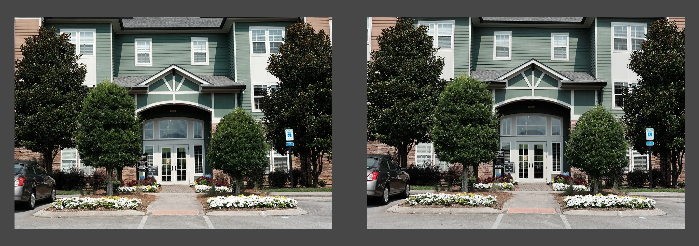
The rest of this describes my purpose and process of creating a Canon Picture Style for a Canon RP, however I’m optimistic that it works for many other Canon models. Describing the whole process was getting a bit long, so I have broken it up into multiple posts that will be easier to consume. This first one is an introduction to my goals and research in creating a Canon picture style that is similar to the FujiFilm Classic Chrome film simulation. Preview: Before and After Result This is a preview of a Canon version of Classic Chrome or “Canassic Chrome” if you can handle the cringe of that portmanteau.
Here is a shot from the XT-4 (left) next to the smell-a-like, Canassic Chrome, applied to an image from the Canon RP (right). I won’t pretend it’s a perfect match but it ain’t too shabby as a place to start. I struggled with the greens but have landed on an acceptable compromise for now.
Here you can see the Before/After of the Canon RP Image. The before image is using the Canon Standard picture style, while the after is using Canassic Chrome.
Canon RP slide with before and after. The difference is subtle for sure.
Start with some overarching goals
There are a few things I’m trying to achieve with this and it is helpful to write those things down. Some are short-term goals and some are long-term goals, but here we go…
1. Get hands-on experience with Canon supplied software
While I have a long history with Lightroom and some experience with Capture One I haven’t worked alot with the Canon supplied software and it provides some unique functionality like creating detailed custom picture styles that no other software can do.
Spoiler alert: They functionally do the things they say they do, but it is not the most “modern” user experience. I don’t think Canon makes the largest resource investment in these outside of a “maintenance” level of investment for compatibility with cameras, OS’s and maybe to fix an occasional bug. So….patience is key.
The software I am specifically talking about is Canon Picture Style Editor v1.29.0 (PSE) and Canon Digital Photo Professional v4.16.11.0 (DPP).
2. Get more stylized JPEGs straight out of a Canon camera with little, if any, post-processing.
I really enjoyed the shooting experience of using film simulations and community-built “recipes” on the FujiFilm camera. It removed a whole step of the workflow from shooting digital photography…the post-processing. You do give up some flexibility, of course, but it was worth it in many cases since the in-camera processing is very good.
3. Replicate the Classic Chrome Simulation in a Canon Picture Style.
This gets to the shortest term goal. Since I have a FujiFilm camera on hand; I can create pretty good reference imagery to attempt to simulate one of their simulations…meta. Classic Chrome seemed as good a place as any to start, so that’s what I am creating. Since this will be the first attempt, it will likely need some testing, iteration, and refinement as I try it in different situations and environments. This will be a v0.1 of this picture style.
Disclaimers
Just to cover some cases, it seemed relevant to put a couple disclaimers out there. So…
- Not a color expert.
- Still getting familiar with Canon software (I’m not a fan right now)
- Doing this for fun, I hope you are too.
Research
It seemed wise to learn what FujiFilm says they were attempting with this particular film simulation before trying to match it. The non-Fuji-official internet has alot of opinions about it, but I thought Fuji, itself, might be a reputable source.
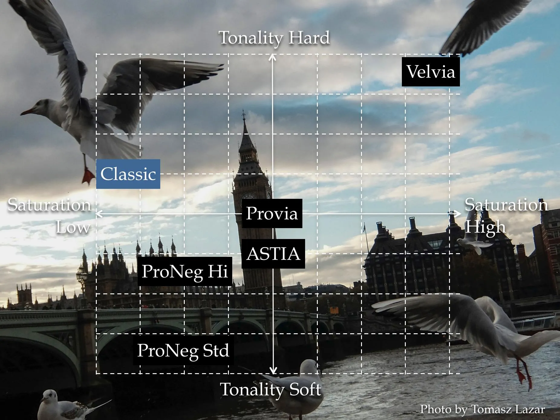
The short version can be seen in this graphic from their article, The World of Film Simulation episode 2↗.
It describes the basics where it is low saturation but slightly above average tonality. I think “Tonality” here refers to contrast and sharpness, but it is a term that gets thrown around quite a bit and tends to lose meaning after a while.
Isn’t it just FujiFilm’s version of Kodachrome?
That is what some of the internet says but it doesn’t appear quite that way. I doubt we would ever see FujiFilm put that in writing but this is what they HAVE put in writing available in the same article linked above.
”a color film simulation version of monochrome”…that does not sound like Kodachrome to me but see Disclaimer #1 above.
However, they have also described Classic Chrome another way in their article, Film Simulation “CLASSIC CHROME”↗
It’s that, “aims to reproduce the ambience found in documentary-style photographs and magazines” that gets me.
It’s like saying, “How can we say National Geographic and Kodachrome WITHOUT saying National Geographic and Kodachrome?”
Where I landed is this, I think they may have used Kodachrome and other films used in National Geographic as an initial source of inspiration but diverged from it to create something their own. Personally, I would describe Classic Chrome as inspired by Kodachrome but not attempting to directly replicate it. Then again, see Disclaimer #1.
Conclusion
At the end of the day, most of the articles and references above probably passed through a marketing filter before being published, so who knows what to believe. For example, the phrase “full-bodied tones” means nothing to me…high contrast maybe?? Next thing will be describing the “jammy notes in the highlights” or that it has a “rose-like warmth that is drier on the second nose”.
My, simplified, takeaways are this:
- Low Saturation
- Slightly higher contrast, especially in the shadows
- Slightly sharper than normal? (Not 100% on that one)
The next step to this process will editing an image shot with the Canon RP to match a similar shot from the XT-4.
Check out the next part: Canassic Chrome Part II- The Initial Match


